The easiest WCAG rule to understand is also the one everyone still ships
Of all the WCAG success criteria, low color contrast is the one with the least ambiguity: it's a hard number, calculated from the exact colors on the page. There's no debate about whether an ARIA attribute is "close enough" — a ratio either clears the threshold or it doesn't. And yet, across large-scale automated audits of the web, low-contrast text is consistently found to be the single most common accessibility failure detected — more common than missing alt text, missing form labels, or broken landmarks. It shows up in muted gray body copy, light placeholder text, pastel buttons with white labels, and disabled-looking states that are actually meant to be read.
That's also what makes it so fixable. Unlike issues that need a human to judge whether something "makes sense," contrast has an objective pass/fail line attached to it — which is exactly the kind of check a scanner can run against every element on every page, instead of a design team eyeballing a handful of screenshots.
What WCAG actually requires
Contrast ratio is calculated from the relative luminance of two colors and ranges from 1:1 (identical colors, no contrast) to 21:1 (pure black on pure white). WCAG sets different minimums depending on what's being checked:
| Element type | WCAG AA minimum | WCAG AAA minimum |
|---|---|---|
| Normal text | 4.5:1 · 1.4.3 Contrast Minimum | 7:1 · 1.4.6 Contrast Enhanced |
| Large text | 3:1 · 1.4.3 Contrast Minimum | 4.5:1 · 1.4.6 Contrast Enhanced |
| UI & graphics | 3:1 · 1.4.11 Non-text Contrast | No AAA tier |
| Decorative text | Exempt | Exempt |
"Large text" means at least 18pt (24px) regular weight, or 14pt (18.66px) bold and up — bigger, bolder strokes stay legible at a lower ratio, so WCAG relaxes the AA minimum to 3:1. "UI & graphics" covers the visual boundaries of buttons, form fields and focus indicators, plus icons and chart lines that carry meaning — added in WCAG 2.1 as success criterion 1.4.11, and one manual swatch-checking almost always misses. "Decorative text," like a wordmark baked into a logo image or incidental text inside a photo, is exempt from the text ratios because it isn't meant to be read as body copy. AA is the tier referenced by most accessibility standards and legal guidance; AAA is a stricter, optional target most sites don't attempt site-wide.
Every low-contrast element on every page — found automatically
A manual contrast check usually means opening an online contrast tool, picking one text color and one background color, and testing them one pair at a time. That works for a single design decision, but it doesn't scale to a real site: it misses hover and focus states, text laid over images or gradients, placeholder and disabled text, and every page you didn't think to test. Abledly's scan is built to cover all of it:
- It renders your actual live pages, not a static design file, so it sees the real computed foreground and background color behind every piece of text and every relevant UI element.
- It applies the correct threshold automatically — 4.5:1 for normal text, 3:1 for large text, 3:1 for UI components and meaningful graphics — based on the element's actual size, weight and role.
- It flags every failure with proof: the element, its colors, the computed ratio, the WCAG criterion it fails, and where on the page it lives.
- It drafts a fix — a suggested replacement color that would clear the threshold — so you're not left guessing what to change it to.
- It's part of your full WCAG 2.1/2.2 AA scan, alongside alt text, labels, ARIA and structure — not a separate tool you have to remember to run.
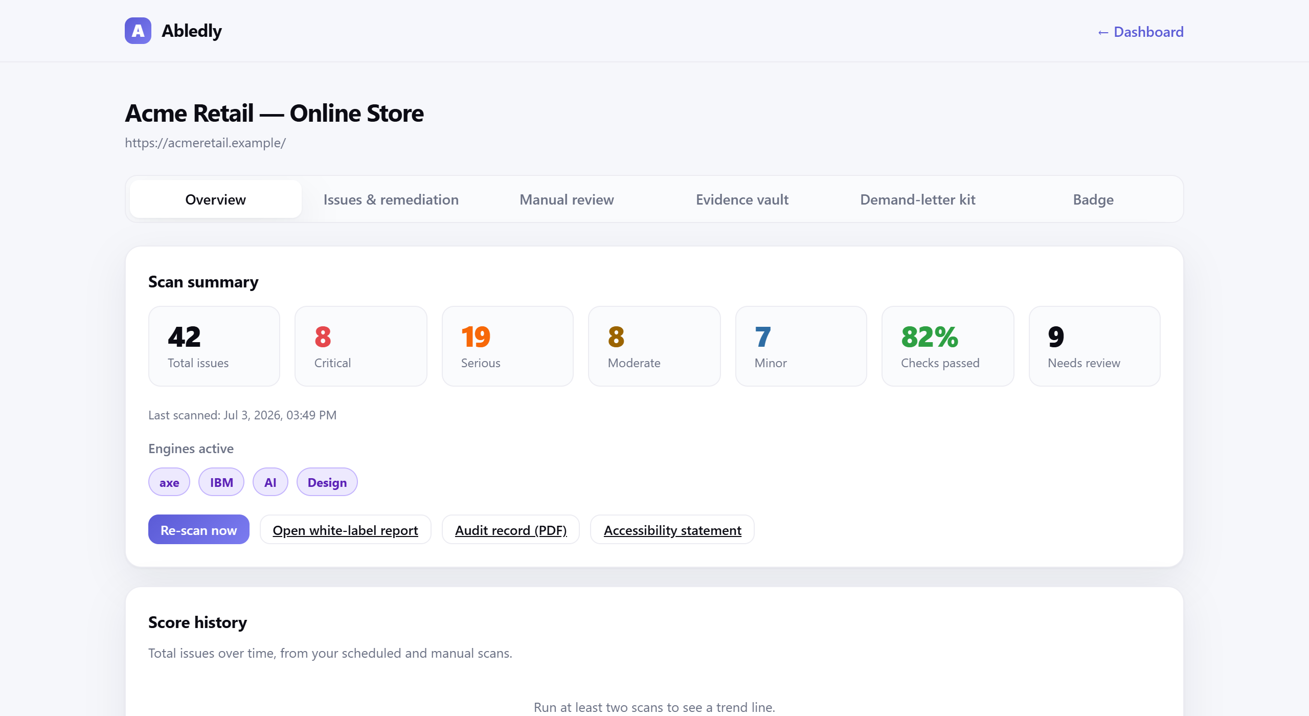
Click to enlarge
An actual Abledly scan report — real WCAG issues found on a real page, contrast failures included, each with a drafted fix.
Contrast is one check among many, and it's one of the ones automation catches reliably — that's also why it's such a common finding. A clean contrast scan doesn't mean the whole page is compliant: things like whether alt text is actually meaningful, whether the reading order makes sense, or whether an interactive widget behaves correctly for a screen-reader user still need a person to judge. Treat this as one solid, objective piece of evidence — not a full audit on its own.
Contrast checking, built into a full WCAG scan
- Automated contrast scan across your whole site, not one page or one swatch
- The correct threshold applied per element — normal text, large text and UI components each checked against their own AA minimum
- Non-text contrast checks for icons, borders and focus indicators (1.4.11) — the check most manual audits skip
- Drafted fix suggestions with a replacement color that clears the threshold
- Automatic re-check once you ship a fix, so you can confirm it actually passes
- Folded into your WCAG 2.1/2.2 AA scan alongside alt text, labels and structure — one report, not a separate tool to remember
Want to see how a low-vision or color-blind visitor experiences your current palette, beyond the raw ratio? Try the vision simulator. Ready to fix what the scan finds? See how Abledly drafts fixes, or check your overall risk with the ADA compliance checker.
Frequently asked questions
What contrast ratio do I need for WCAG AA?
WCAG 2.1/2.2 Level AA requires a contrast ratio of at least 4.5:1 for normal text against its background (success criterion 1.4.3, Contrast Minimum). Large text — 18pt (24px) regular weight, or 14pt (18.66px) bold and up — only needs 3:1, because bigger, bolder strokes stay legible at a lower ratio.
What's the difference between WCAG AA and AAA contrast?
AAA is the stricter, optional tier: 7:1 for normal text and 4.5:1 for large text (success criterion 1.4.6, Contrast Enhanced), compared with AA's 4.5:1 and 3:1. Most legal and regulatory references — including the guidance most ADA plaintiffs' firms cite and standards like EN 301 549 — point to AA, so that's the bar to clear first.
Does the 3:1 contrast rule apply to buttons and icons, not just text?
Yes. WCAG 2.1 added success criterion 1.4.11, Non-text Contrast, which requires a 3:1 ratio for the visual boundaries of UI components — button borders, form field outlines, focus indicators — and for graphical objects like icons and chart lines, whenever they're needed to understand the content. It's a separate check from the text-contrast criteria, and one manual swatch-checking usually misses.
Can an automated tool check color contrast for my whole site?
Yes — that's what Abledly's scan does. Instead of picking a handful of colors to test by hand, the scan renders every page, reads the actual computed foreground and background color behind every piece of text and relevant UI element, calculates the real ratio, and flags anything under the WCAG threshold along with the specific element, its colors and the criterion it fails.
Does passing contrast checks mean my site is WCAG compliant?
No. Contrast is one success criterion among many, and it happens to be one automated tools catch reliably — which is also why it shows up so often in scans. Things like meaningful alt text, logical reading order, and whether an interaction genuinely makes sense to a screen-reader or keyboard user still need human review. Treat a clean contrast scan as one solid piece of evidence, not a full compliance certificate.
Find every low-contrast element on your site
Run a free scan against WCAG 2.1/2.2 AA — contrast, alt text, labels and structure, all in one report, no widget installed.
Run your free scan →